Three-color portrait

Clearly I’m still struggling with portraits – haha
Let’s start with what I like. I painted this using three colors – hansa yellow, ultramarine and carmine. I also only mixed colors on the paper – not in the palette. I really like working this way, and it’s probably something I will continue to do. It seems to give the colors in the painting more life than if I were to try to mix the exact shade before painting with it.
As far as the portrait itself – ugh. I think the left side was more successful than the right side. Here’s a look at it with the right side blocked out:
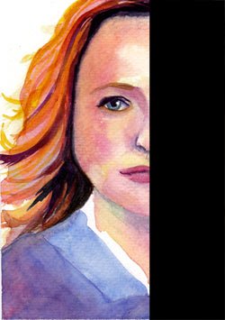
It could have used some more depth around the eye, and obviously I didn’t spent much time on the clothing or hair. This was technically just a sketch, so I didn’t go into much detail. Overall, though, I don’t mind how it turned out.
Now, what is up with the right side? Geez! Between the weird eye and the snarling, swollen upper lip it’s pretty freaky! haha. I will say, though, that it looks far better on its own than when it is coupled with the left half:
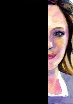
When you put both halves of the face together…that’s when things get really weird 😀
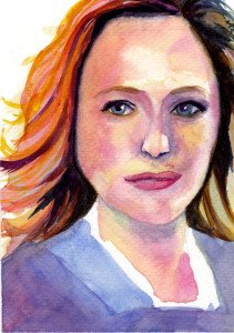
I definitely need to work on my drawing skills to get better symmetry/accuracy in my faces. I also need to find a way to make the hair blend better with the face. Mouths and noses are obviously still an issue for me, and with this painting in particular I didn’t feel like the eyes went as well as usual.
For now, though, I am having fun with the three color paintings and will continue in that vein. I think I’m going to spend the next few weeks focusing on portraits to try to get a handle on how to make them look better. Wish me luck!